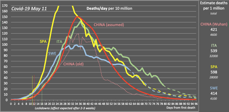
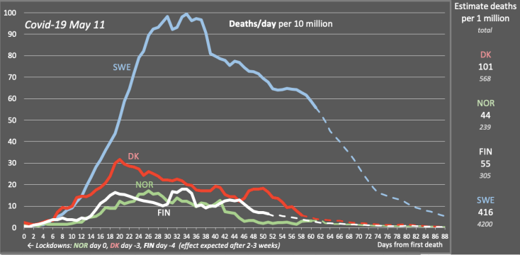
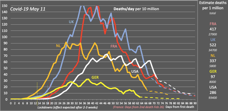
UPDATE May 11: All 12 countries in the forecast are now at about 5 deaths per million per day or lower, Sweden being highest and most behind. In the beginning of June, all countries will probably be at 1 death per million per day or lower. What will happen when lockdowns are being lifted is unclear though. Effects on severe cases should be seen within 2 weeks and on deaths within 3 weeks.
On May 11, many European countries started to remove restrictions. After 2 months in lockdown, as in Italy for example, people seem to gather more than would be recommended. In the next 2-3 weeks we will know what effects this will have. A second lockdown cannot be excluded if numbers start increasing again.
Obviously it is important that we keep following the advice for limiting the spread of the disease. It’s not over at all, but we can do this together.
The curve for China is an estimated distribution of additional deaths reported on April 17 (see update May 4 below).
The last six days of daily deaths in Sweden is still being calculated in order to compensate for delayed reporting of deaths in Sweden. Accumulated deaths on May 11 was estimated to 3536, while the officially reported number was 3256. Daily deaths on May 11 was estimated at about 60.
Here are the latest charts for May 11 (click on the images):
§
This blog post, which will be updated regularly, contains a rough forecast for the Covid-19 pandemic situation in 12 countries, with three data points:
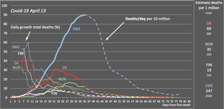
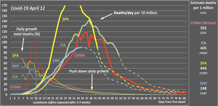
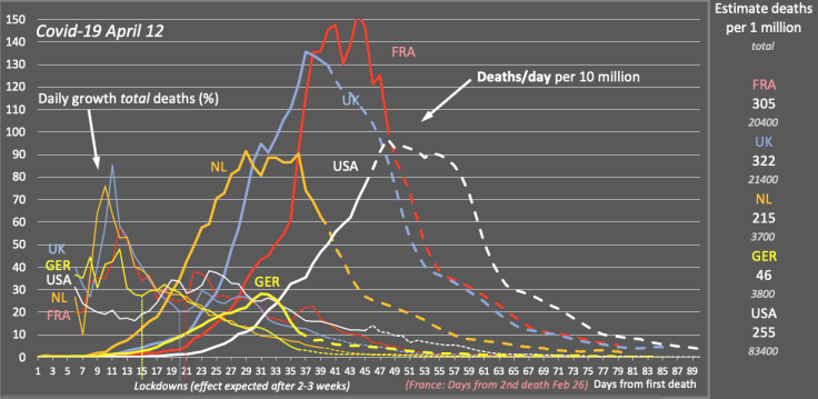
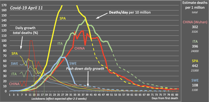
- Daily growth of total deaths in percent (thin line to the left). Dashed graph is the forecast. UPDATE April 26: This graph has been eliminated since it doesn’t add much information.
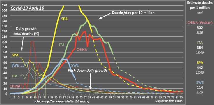
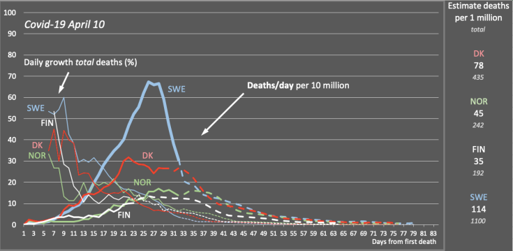
- Number of deaths per day per 10 million inhabitants, average over 5 days (fat curve to the right). Dashed graph is the forecast.
- Estimate of total deaths per 1 million inhabitants, plus total number of deaths (numbers to the right).
NOTE: The forecasts are based on math only—I have no knowledge of epidemiology—and are very uncertain (the model is particularly sensible for sudden changes in growth percentage before reaching the peak of daily deaths).
The basis for the forecasts are a few real observations, with the model described further down in this post. The essential observation is that the growth of total deaths in percent starts high in all countries (40-50 percent) and then declines day by day (partly for mathematical reasons, partly for a decline in the growth of daily deaths). From this observation, the forecasts are based on the time series of the daily growth percentage in China and in some cases also Spain. See below.
The take-away of the observations is that it is essential to push down the daily growth of total deaths (by pushing down the spread of the disease). Note that a small difference in percentage makes a huge difference in the number of deaths over time. If we have 100 dead today and 20 percent growth, we will have 4,600 dead after three weeks. With 30 percent daily growth we will end up with 25,000 deaths! Which measures are most effective should be answered by epidemiologists.
This is the model for the forecasts:
The estimates in the graphs above are based on a few simple observations on the number of deaths from Covid-19. The number of deaths is used since this appears to be the most reliable data point. The number of “confirmed cases” is considered by many to be largely underestimated, due to many cases being asymptomatic, and the number also correlates mainly with the number of tests made, which can be seen in data from Italy.
The number of deaths is also more relevant to the healthcare system—it seems to be directly proportional to the number of persons in ICU (at least in Italy, by a factor of 1 to 5 or 6) which is the critical number for the hospitals. However, also the number of deaths may be inaccurate since it is unclear how many deaths related to Covid-19 are not registered, e.g. for people dying in their homes.
These are the observations:
- In all countries, the total number of deaths increases day by day by a percentage (exponential growth).
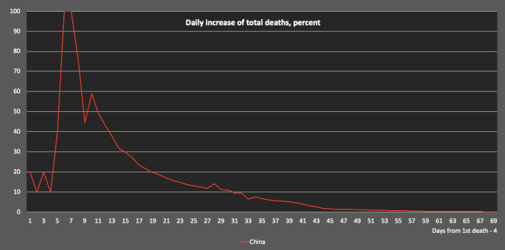
- In most countries, this percentage starts high (40-50 percent) and after about ten bumpy days it declines day by day, partly for mathematical reasons, partly due to a decline in growth of daily deaths (over time, the growth of total deaths will approach the growth of daily deaths asymptotically). Here is how this looked in China (click on the image):
And here are the percentage curves for 12 countries, starting from the day in each country for one death per one million inhabitants. Note how all countries eventually seem to follow the same slope and path for this curve:
The model uses this pattern, copying the time series of China for the daily growth in percent.
E.g. if a country one day has a growth of total deaths of 17 percent, the following percentages below 17 percent from the China time series are used for the forecast. For one percentage at a time, the number of total deaths the next day can be calculated (as an estimate), and from this also the deaths per day for the next day.
§
Notes:
- The number of daily deaths used in the graphs and in the calculations is an average over five days.
- For the calculation of deaths per inhabitants in China, the population of Wuhan (11 million) has been used.
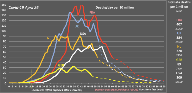
- France had a very long time from the first death to the second death. For easier comparison, the second death in France has been used as a starting point.
- Countries covered in this post: China, Italy, Spain, Sweden, Norway, Denmark, Finland, UK, France, Netherlands, Germany, and USA.
Data Sources: https://ourworldindata.org/covid-sources-comparison, https://www.worldometers.info/coronavirus/, https://c19.se, https://lab24.ilsole24ore.com/coronavirus/, https://www.folkhalsomyndigheten.se/smittskydd-beredskap/utbrott/aktuella-utbrott/covid-19/bekraftade-fall-i-sverige/
§
Earlier updates:
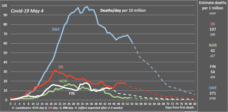
UPDATE May 4: All the 12 countries still seem to have passed the peak of daily deaths, although the situation is unclear for countries with the lowest number of total deaths per 1 million, e.g. Finland and Denmark. The long term number of deaths per 1 million in the USA still seems to remain significantly lower than in Spain, Italy, France and the UK. The graph for daily deaths in China have been updated, following an assumed distribution of the 50 percent increase in deaths reported on April 17. The number of daily deaths in Sweden for the last seven days is still being calculated, with total deaths estimated to 3051.
It is not clear whether the countries with low number of total deaths such as Finland and Denmark have passed the peak of daily deaths or not. On the other hand, Norway and maybe also Germany seem more clearly passed the peak. What will happen when these countries lift their restrictions will be important to follow since immunity might be lower.
The assumed distribution of daily deaths in China, including the 50 percent increase in total deaths reported on April 17 without information on when these deaths occurred, is close to the graphs for Italy and France, although with a steeper decline of daily deaths. The steeper decline agrees with the low number of daily deaths—mostly zero, occasionally one—reported lately by China.
The number of daily deaths in Sweden is being calculated to compensate for delayed reporting of deaths in Sweden. The total number of deaths on May 4 was estimated to 3051, almost 300 more than the officially reported number of 2769. The number of daily deaths during the last week was estimated to between 65 and 73.
The calculation is based on an observed correlation between daily deaths and number of cases in ICU.
Here are the latest charts for May 4 (click on the images):
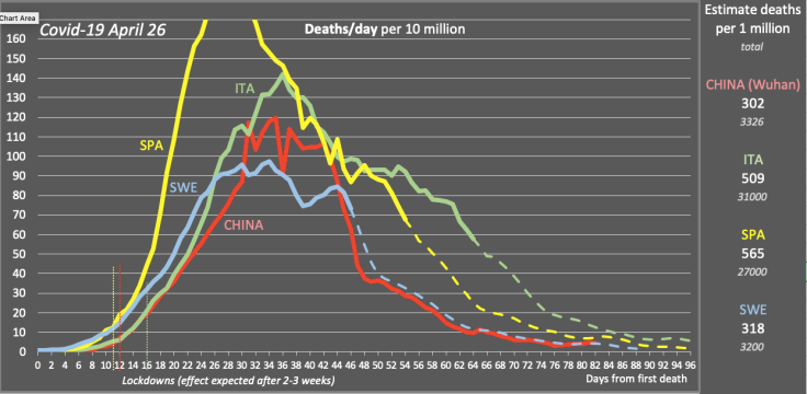
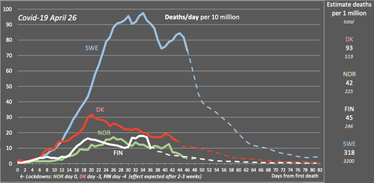
UPDATE April 26: All 12 countries still seem to have passed the peak of daily deaths. Sweden has had a slight increase but seems to be at the end of the peak. Finland has had a strong peak but it seems related to delayed reporting. France, UK, Netherlands, Germany, and the USA all follow the forecast fairly exactly, although the peak of daily deaths for USA has been extended over the last days. Generally, all countries seem to see a slower decline of daily deaths than China.
• It has been clear for a few days that all of the 11 countries, particularly those that have clearly passed the peak of daily deaths, have a slower decline in daily deaths than China (Wuhan) had. I can clearly see this since the forecast model is built on the daily growth factors of total deaths in China.
On the other hand, I have not been able to add the 50 percent increase in total deaths for China reported on April 17 since there is no information about when these deaths have occurred.
Adding the newly reported deaths over almost the whole time series, with an emphasise over the peak and after the peak of daily deaths, makes the decline in daily deaths for China more in line with European countries. But it would also mean that China still should see a few deaths per day, and that is not what China is reporting.
Either China had a higher peak and a much faster decline of daily deaths than European countries, maybe due to its very severe lockdown, or the recent reports of zero daily deaths in China is incorrect.
• The numbers for Sweden for the last six days are still being calculated since reporting of deaths in Sweden keeps being significantly delayed.
• Large peaks for daily deaths in Finland on April 21 and 23 are probably due to delayed reporting and have been slightly distributed in time.
• I have now eliminated the graphs for daily growth of total deaths since they don’t make much sense in the diagram any longer. I have also extended the x-axes (days from 1st death) in the diagrams.
See the latest charts for April 26 below.
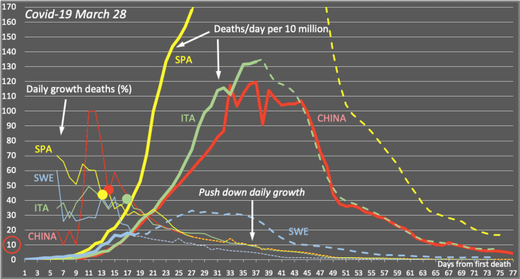
For reference, here’s is my forecast from March 26, one month ago. It is interesting to note how close the forecasts for Italy and Sweden has been to the real curves, though you can clearly see the slower decline than expected in Italy. In contrast, the forecast for Spain was too high due to a very fast increase in daily deaths initially in Spain.
Here are the other most recent charts from April 26 (click on the images):
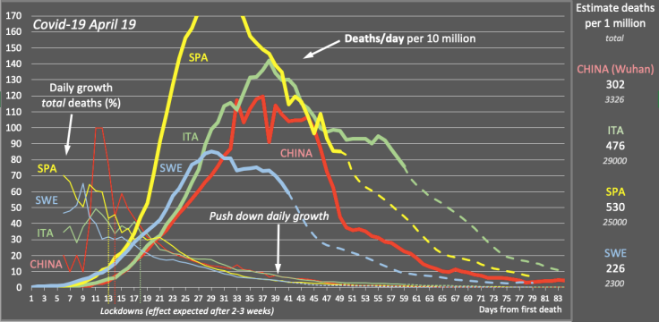
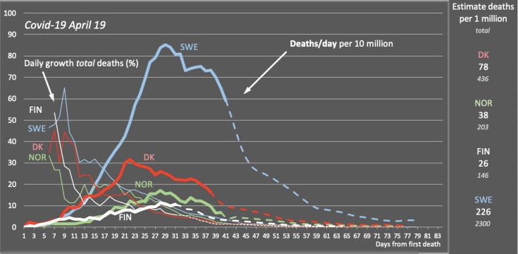
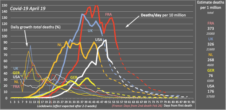
UPDATE April 19: All 12 countries seem to have passed the peak of daily deaths, including USA. Italy sees daily deaths declining again efter a few days at a constant level. The last six days of daily deaths for Sweden are still being calculated in order to compensate for delayed death reports in Sweden. Total deaths for Sweden on April 19 was calculated to 1734, and for April 20 to 1787, about 200 above the number officially reported.
The number of deaths in Sweden is calculated from the ratio of cases in ICU to daily deaths, correlating this value with Italy. The calculation is compensated for this ratio being on average 26 percent higher in Sweden than in Italy (see update for April 12 below).
Note that the US seems to be headed for 176 deaths per 1 million inhabitants, which is significantly lower than in China, Italy, Spain, France, UK, Netherlands, and Sweden. Some news outlets report high numbers of deaths in the USA but don’t seem to take into account the large population.
Also note that passing the peak of daily deaths means that the country has passed the peak of new daily cases 2-3 weeks earlier. In order to get to zero, however, we still need to be careful to slow down spread of the disease—washing hands, keeping distance, staying at home when we are sick, not meeting elderly, and avoiding social meeting.
China: On April 17, the Hubei Province issued a “Notice on the Correction of the Number of New Coronary Pneumonia Cases Diagnosed and the Number of Diagnosed Deaths in Wuhan” in which it reported 1,290 additional deaths that had not been previously counted and reported, bringing the total number of deaths in Wuhan from 2,579 to 3,869, an increase of 50%. These number have not been added to the model, assuming that the added number of deaths are fairly evenly distributed of the time series and thus essentially not changing the daily growth percentage in China, which is used as a basis for the forecast for other countries.
See the latest charts for April 19 below.
UPDATE April 16: The forecast for Sweden is still difficult to make due to delayed death reports. I still use an alternative method for estimating deaths the last six days (se update April 12 below), but the forecast is a bit lower now and Sweden still seems to have passed the peak of daily deaths. France and the Netherlands struggle to get passed the peak. Italy’s daily deaths don’t decline as fast as in China. The forecast for USA is significantly increased due to rising daily deaths.
Charts for April 13, 14 and 15 are added below without comments.
The latest charts for April 16:
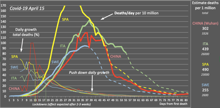
UPDATE April 15 without comments:
UPDATE April 14 without comments:
UPDATE April 13 without comments:
UPDATE April 12: The forecast for Sweden is significantly increased, putting Sweden at the peak of daily deaths today. A different model is used for Sweden in order to compensate for an obvious delay in reported deaths for the last six days, and it is obviously highly uncertain. Several other countries have a lowered forecast which may be due to delayed reports of deaths during Easter (see charts below).
Explanation of the new estimate for Sweden:
In the last few days there have been several indications that the data for deaths in Sweden are not complete.
- The shape of the curve showing daily deaths has been more pointed compared to all other countries.
- The decline of the growth of total deaths has been quicker than in any other country.
- The growth percent of total deaths has fallen to a value lower than in any other of the twelve countries except China and Italy which are far ahead in time.
- The ratio of cases in ICU to daily deaths is suddenly much higher than in Italy, where the value has been fairly stable along a certain curve, and also much higher than in Sweden only a week ago.
This all indicates that reported deaths in Sweden for the last days are below the real value. Since reported deaths have been delayed regularly during weekends in Sweden, and since Easter falls this weekend, the delay is expected, also by the health agency Folkhälsomyndigheten which expects real data on Tuesday April 14 or later.
For this reason, I have used a different model to calculate an estimate for daily deaths in Sweden for the last six days. The estimate is based on the ratio of cases in ICU to daily deaths. In Italy where both data series are available, this ratio started at about 12, reached its minimum of about 4.5 at the point where daily deaths reached its maximum, after which it started increasing again. The peak of cases in ICU was reached about one week later.
Comparing these values with Sweden, the cases in ICU seems to reach its peak about one week from now, on April 19, and the ratio of cases in ICU to daily deaths appears to reach a minimum which is slightly higher than in Italy, about 5.5. Using these values, it is possible to estimate the number of daily deaths from the cases in ICU. The number of daily deaths appears to reach its peak today, April 12, at 92 (the graph is slightly lower, showing an average over five days). This forecast is obviously highly uncertain, but it fits better with the other countries.
The lowered forecast for several other countries—in particular France and UK—my also be due to delayed reports of deaths during Easter.
UPDATE April 11: The forecasts still seem stable. All 12 countries, except USA, seem to be at the peak of daily deaths or having passed the peak. The model indicate that USA could possibly reach the peak within a few days, even though this might not seem we would expect.
The forecast for Sweden also seems stable but is somewhat uncertain since the time series from the health agency, Folkhälsomyndigheten, is updated daily with several changes in data points more than a week ago, and with the value of the last day often too low due to delayed reports from local health regions.
The number ofta daily deaths in Sweden is probably around 65-80 at the moment. Tomorrow I will try to adjust the forecast based on the number of people in ICU, comparing with Italy that has much more data available.
UPDATE April 10: Situation relatively stable in all 12 countries (see charts below).
UPDATE April 9: Sweden still seems to have passed the peak of daily deaths. In the UK, daily deaths keeps increasing, pushing the peak a few days ahead and raising the forecast for total deaths. Also for the US, the forecast keeps increasing.
This highlights that the forecast from this model is highly uncertain and sensible for small changes in the growth of the number of total deaths, before the peak of daily deaths is passed.
UPDATE April 8: Sweden seems to have passed to peak of daily deaths. Daily deaths in USA and Germany keep increasing.
The forecast for Sweden depends much on how the data is reported. The Swedish health agency Folkhälsomyndigheten has reported a delay in registering of deaths. With the numbers of daily death redistributed over the passed weeks by Folkhälsomyndigheten, the forecast for Sweden has changed significantly to a lower level.
UPDATE April 7: Among the 12 countries being covered here, most now seem to have passed the peak of daily deaths, and the rest being a few days from the peak.
UPDATE April 2: (see this blog post: Update on Covid-19: Sweden remains below Italy, Spain’s forecast greatly improved). At this point, the forecast for both Sweden, Italy, and Spain was close to what we can see in more recent updates as of April 19, i.e. 17 days later:
UPDATE March 28: This forecast showed a significantly lower curve for Sweden. The reason was that death reports in Sweden started to become delayed, and the reported number of deaths at this time was much lower than real numbers.
UPDATE March 26: This was the first update that I published (see this blog post: Covid-19: We have to push down daily growth below 10 percent). Comparing with more recent updates, as e.g. April 19—i.e. over three weeks later—you can see that the forecast for Sweden was fairly accurate, for Italy it was a little too low, and for Spain too high. Still it gives a hint of the model being quite useful:














Leave a Comment. Latest comments are displayed on top. Comments are not threaded.